Our Answer
Amitié stands out from its competitors due its sole focus on friendship. Group interactions, instead of one-on-one matches are encouraged, with the assistance of AI generated chat prompts that encourage ongoing coversation after the initial meeting.
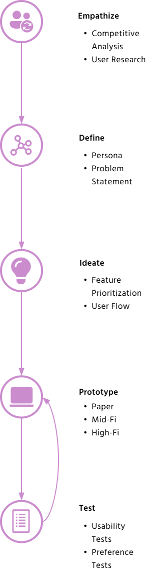
How We Got There
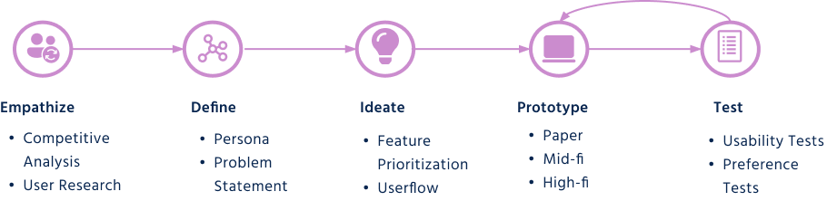
Research & Analysis
We collected 6 user interviews from people between the ages of 25 and 40 that are interested in expanding their social life. 4 out of 6 interviewees were unhappy with their current social life, and all felt that existing apps and online forums were ineffective for finding new friendships.
Users do not believe available competitors can help them improve their social life
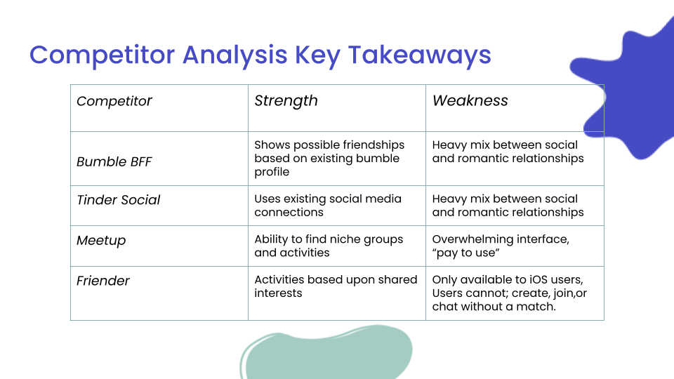
Our competitor analysis revealed some notable flaws in some of the most well known social apps:
- Tinder Social: Use is only for preset groups of people to match with other groups, leaving no space for an individual that may be looking to make friends.
- Bumble BFF: The same profile is used for both the romantic and platonic parts of the app, which blurs the line between friendship and dating and causes confustion.
- Meetup: Users need to pay to be able to create a social group, and the app doesn't help people create a deeper relationship outside of the initial match for a specific interest.
- Friender: Users can only participate by making and joining groups after they've matched individually with people like a dating app.
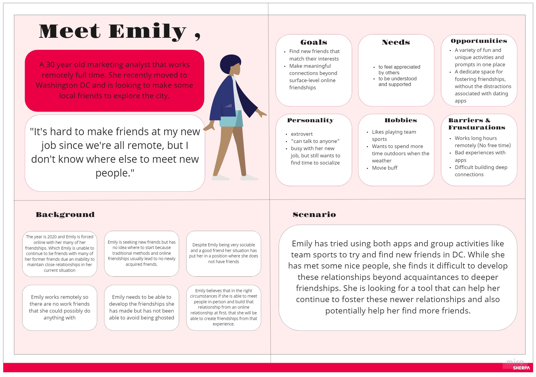
Persona & Definition
Emily was created to embody the common struggles people facing when looking for new friendships according to our research. Emily has tried meeting people online before, but the friendships have fizzled out before they have the chance to form a lasting bond. She has been unable to move beyond the initial acquaintance phase.
Emily's predicament highlights how online friends can be relegated to a separate bucket from "real" friends, where online friendships are seen as one-dimensional and only focused around the initial shared interest. To address this, we redefined our problem statement:
How can we create a unique mobile experience that helps users foster long-term friendships through ongoing engagement over time?
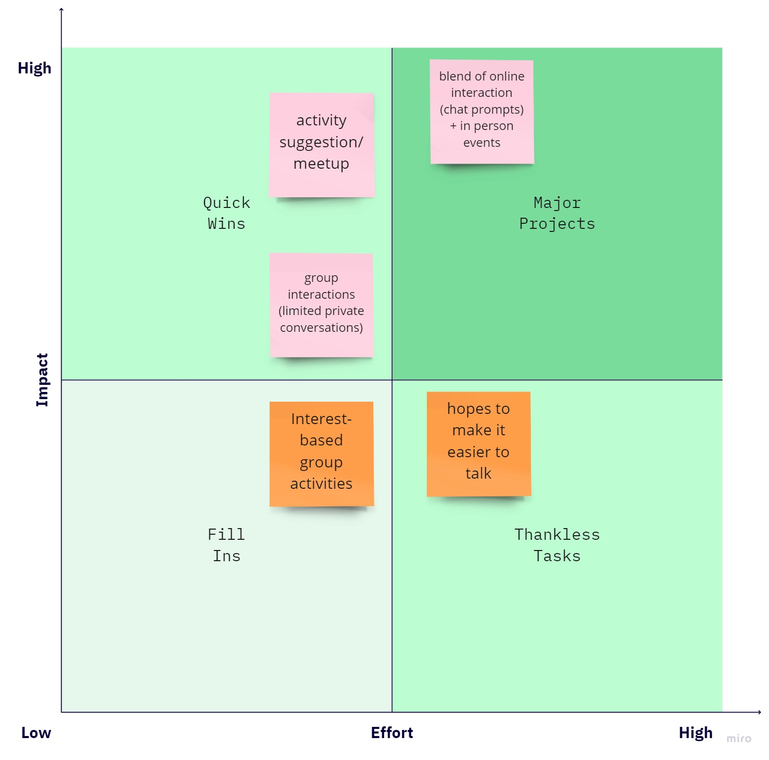
After brainstorming potential solutions to solve for this problem, we decided to focus on the below features. Our unique solution is to create an AI chatbot integration that will continue prompting group members to maintain their conversations with eachother, while also diversifying outside of the intial core interest of the group.
The pink colored sticky notes are the features we chose to focus on for this project.
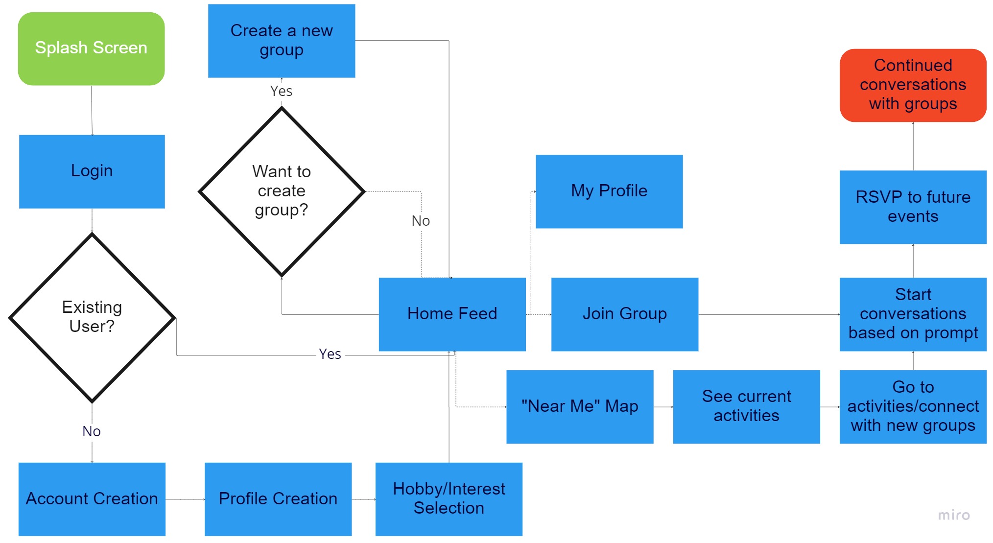
User Flow
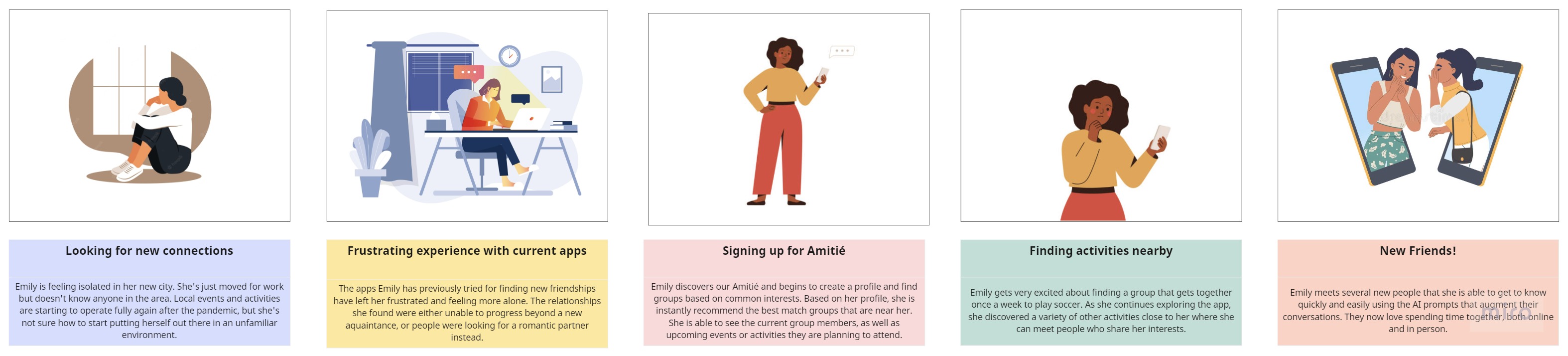
We outlined Emily's experience on Amitié via a story board, and defined the scope of our project by what could be accomplished in time for our deadline, two weeks away.
Emily's User Story
We then created a user flow highlighting the 5 key sections of the app.
First Iterations
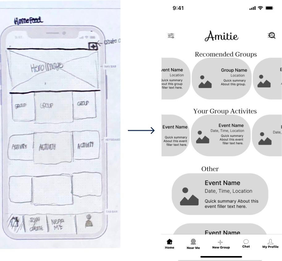
After our user flow was finalized, we sketched out Amitie’s key features to start validating our ideas. We wanted to make sure our homepage layout was crystal clear, and also that it was quick and intuitive for users to start joining groups and interacting with each other. Our first round of testing led to key improvements in the mid-fi.
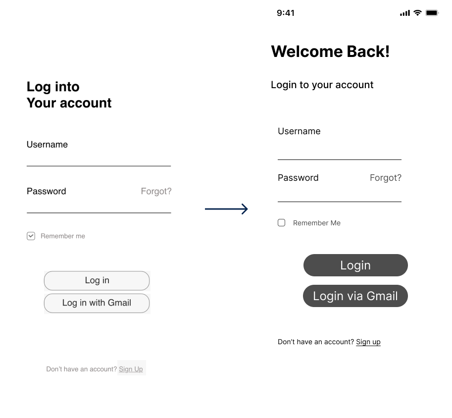
Improving the UX writing on the Login Page.
Justification: In testing, 4 out of 5 participants were unable to sign up for the app, because they were not able to see the “create new account” link or differentiate between creating a new account and signing into an existing one. In response, we made the account creation link darker and closer to the rest of the elements on the the screen. We also changed the heading on the login page to "Welcome Back" to make it more clear this was for an existing user.
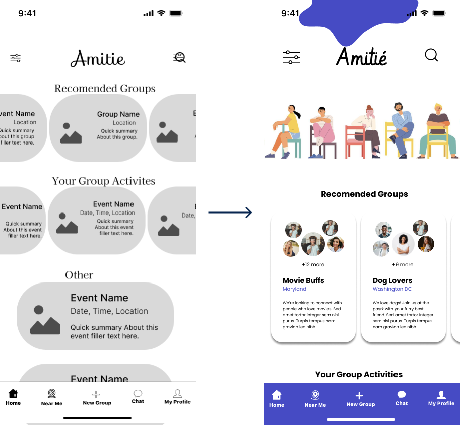
Changing the homepage layout.
Justification: The original layout of multiple carousels was great for fitting a lot of content on the homepage, but it wasn't clear what the differences between the sections are. To match user expections on a mobile device, we changed the layout to include a vertical list to scroll thoughs and also added headings for each section.
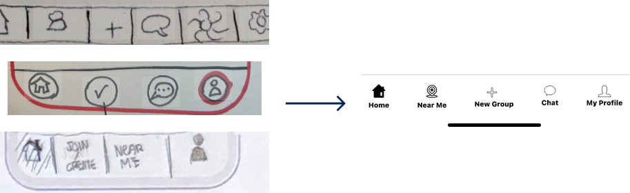
Creating a uniform navigation bar.
Justification: Each team member had a different idea for what our main navigation would look like. Before moving into mid-fi and our second round of testing, we discussed the pros and cons of each version before creating a uniform one.
Further Iterations
After more testing, we made some more iterations to our design before creating and applying our style guide.
More white space and larger cards on the homepage.
Justification: Users were overwhelmed by the second iteration of our homepage because the elements were two close together, and the text too small for quick scanning. Our final version has more room for images, and provides the more laid back and calm feel we want to express.
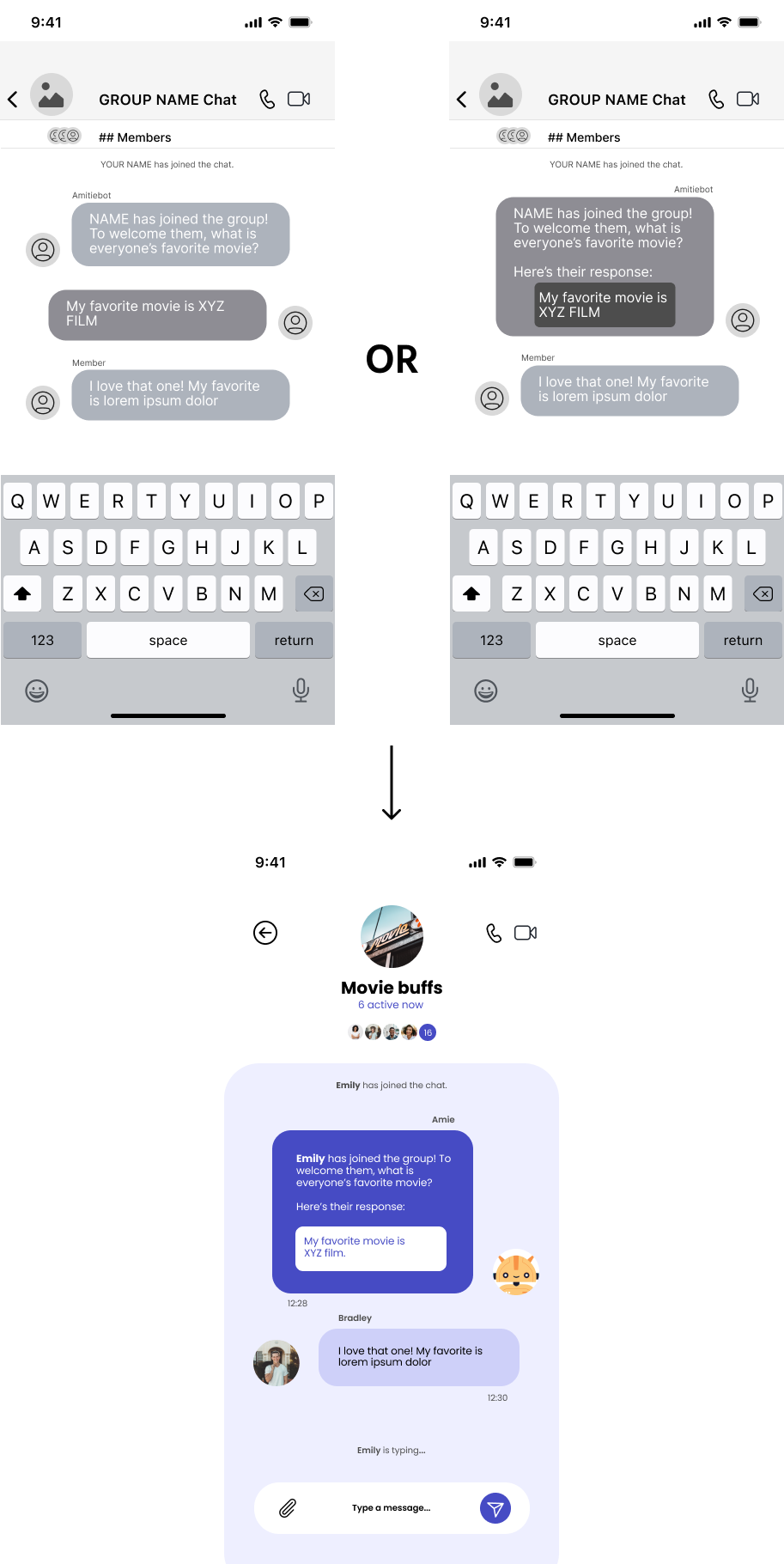
Preference testing for the group chat introduction.
Context: The initial chat introduction feature was very important since this would set the tone for a new user's ability to integrate with a chosen group. We wanted the chat experience to be as friendly as possible, but also wanted to make sure new member introductions were suffiently highlighted so they would stand out, especially in chats with lots of members.
We designed two alternatives for this feature: the first looked like a normal chat, while the second had the new user's response nested inside of our chatbot, Amie's, prompt. During our tests, we asked users which experience they would prefer when being introduced to a new group.
Results: Out of our 6 respondents, 5 chose the nested chat option, so we moved forward with that option for our high-fidelity mockup.
Final High-Fidelity Solution
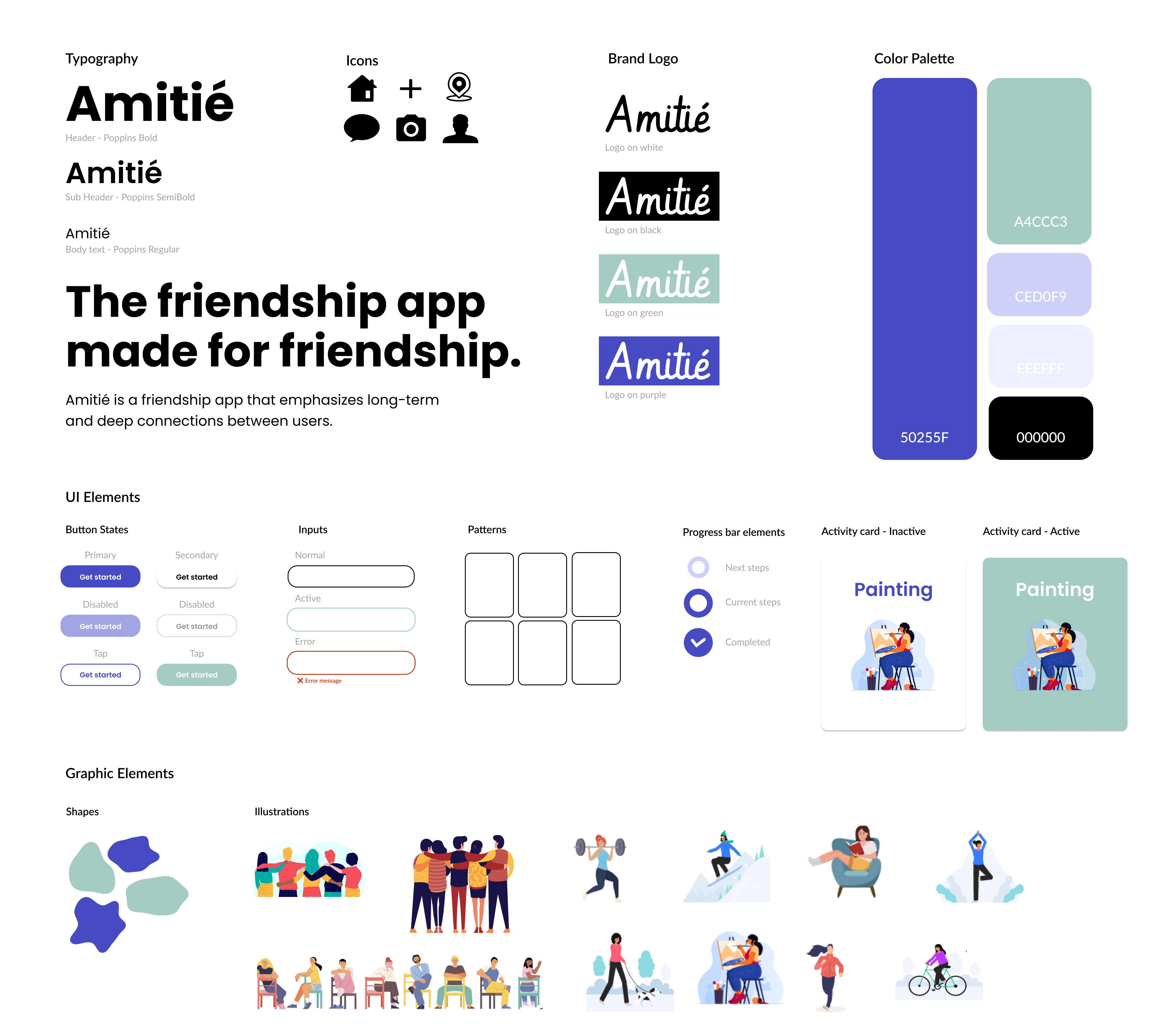
When selecting our colors, we were careful to steer away from any reds and pinks to avoid any association with romantic relationships. We wanted a modern, vibrant UI so we chose a bold purple with an accenting green, along with strong bold headings and a sans serif font. To introduce some softness as a contrast, we incorporated rounded, organic shapes and illustrations into the final product.
We implemented this new design system to create our final high fidelity protoype:
Concluding Thoughts
This project was especially rewarding to me as I could clearly see the progress I'd made in my 6 months of trainging. In our group dynamic especially, we were quickly and seemlessly able to highlight our strengths while making up for our individual weaknesses. This allowed us to design a significant amount of features despite our tight deadline.
Future iterations would include further defining how the chat prompt feature would work for furthering ongoing conversations within a group outside of new member introductions.