Project Type
Responsive Web Design
Duration
4 weeks (Jul 27 2022 - Aug 24 2022)
My Role
UI Designer, solo project
Tools Used
Figma, Useberry, Maze, Invision, Pen and Paper
Deliverables
Usability testing, problem definition, design system, wireframes
Final Product
High-Fidelity Responsive Web Design Wireframes
Current Experience
The DoI’s website needs to communicate a lot of information in an accessible way, but the current site layout and organization of information is immature. Some major issues are:
- inconsistent navigation between different sections of site
- ambigious and sometimes duplicative section titles
- outdated visual design
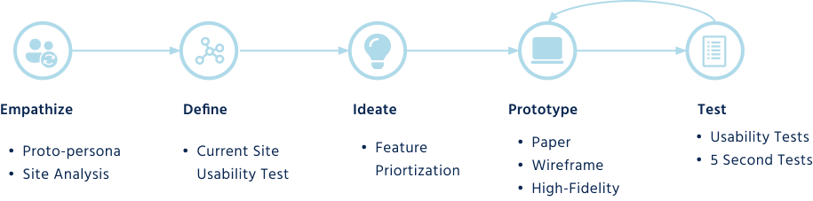
My Solution
Proto-persona & Analysis
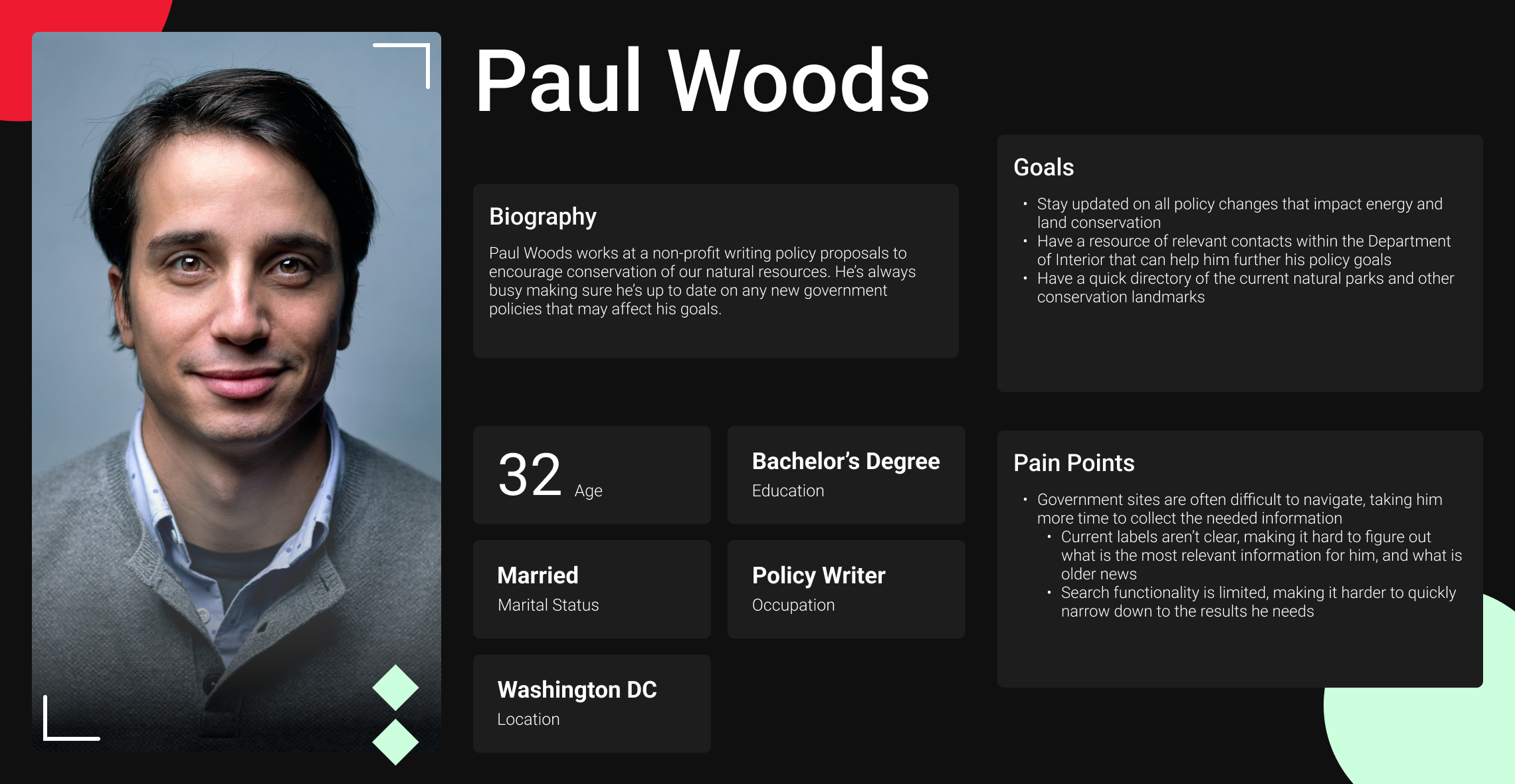
I created Paul as a starting point for imagining the journey a user would take through the DoI’s current site. As I followed his journey, I took notes of the strengths and weaknesses of each page’s design and what elements could prevent Paul from accomplishing his goals.
Paul is looking to find the most updated information about the DoI's policies and needs to be able to navigate the site quickly.
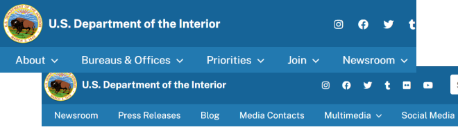
The header navigation changes for different sections, making navigation between sections impossible wihout first nagivating back to the home page.
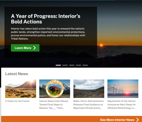
It’s unclear how the content in the hero carousel is different from the section directly below it.
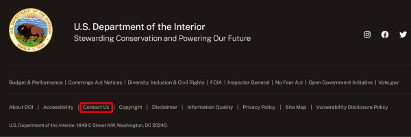
A government agency must be easily accessible to its constituents, but the DoI’s contact form is only see in the footer on the homepage.
Usability Testing & Navigation Redesign
Only 1 out of our 5 testers were able to complete all 3 tasks in our usability test for the current site. It was not clear what was clickable in the header navigation. A lack of universal navigation in the site header led to users getting stuck in certain sections of the site and having to navigate back to the homepage. Also, heavy jargon and duplicated content across sections of the site made navigation difficult.
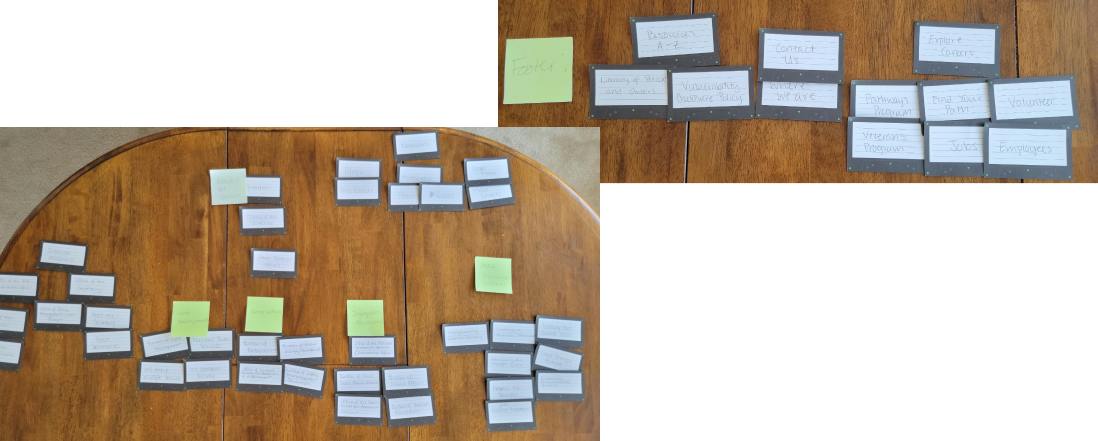
With this feedback, I started by conducting a card stort to determine the best way to organize the header menu to reduce this confusion. I removed the “bureaus and offices” section from the header navigation and distributed those links into the “about” section. I also rephrased several sections to remove jargon that users found confusing in testing. There were several duplicate titles that I also removed.
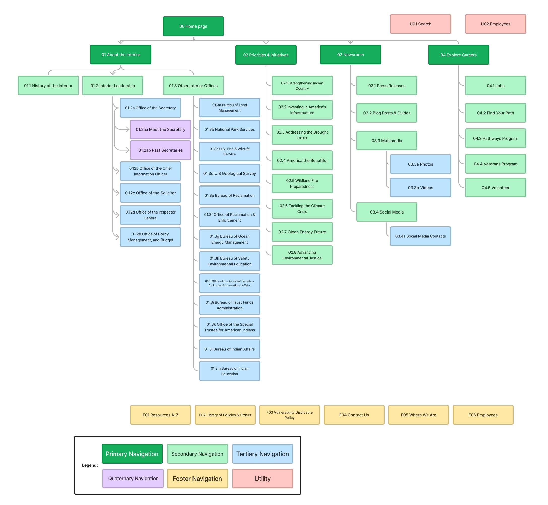
New Sitemap
Design Iterations
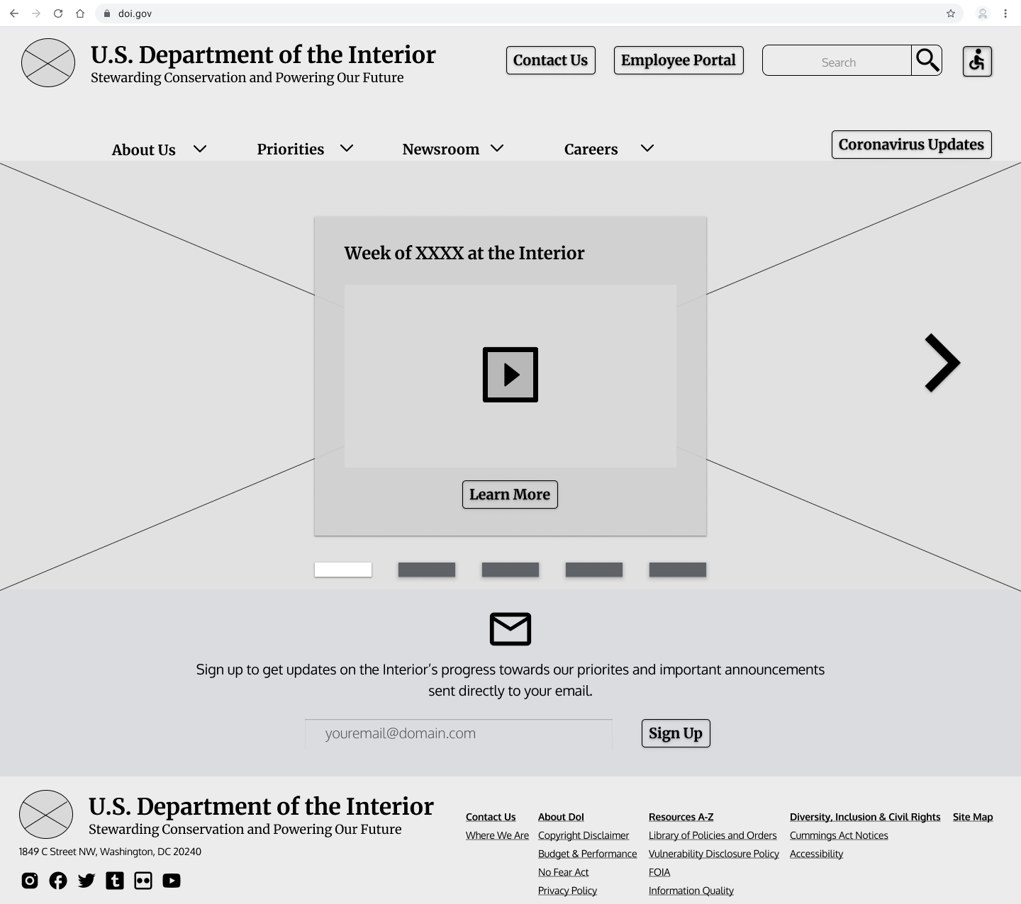
Users of the current site felt overwhelmed by the amount of information on the current homepage, and also found the content chunking confusing and duplicative. To solve for this, I started by simplifying the homepage down to only include a carousal of the most recent posts and updates of department activities, and an option to subscribe for email updates.
However, this design proved to be too simple. 5 second test results showed that users still didn’t understand what the DoI did and how it pertained to them. While they were drawn to the carousel based on its prominence on the page, they didn’t fully understand how the different articles and videos were related to eachother.
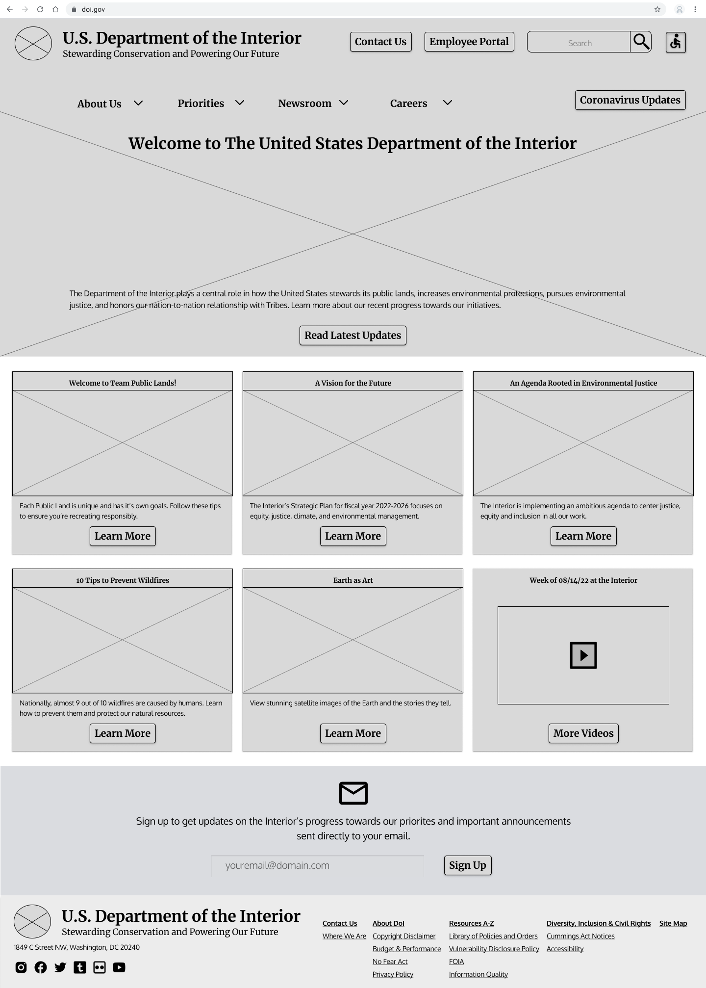
The second iteration of the homepage removed the carousel in the hero and instead provided the DoI’s mission. The news updates were moved below the hero and broken out into a grid so that all the information could be seen immediately.
After receiving feedback that the weekly DoI update video being included along with the recent blog posts was not intuitive, I further iterated on this layout for my high fidelity prototype and brought back a video carousel towards the bottom of the page for only the update videos.
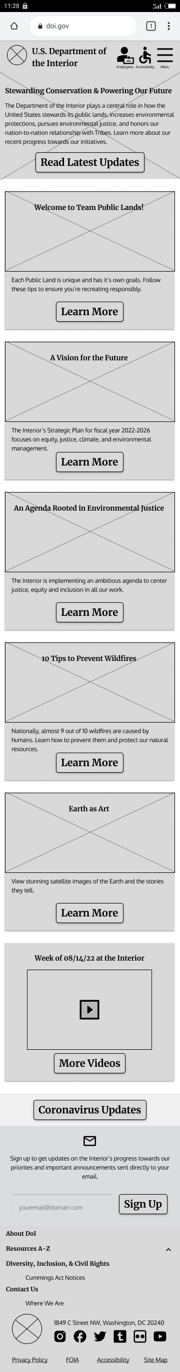
Implementing a Design Sytem for the final Solution
I derived my main color palette from the oranges, browns, and teals found their logo. The old site was predominantly blue, but I chose these warmer colors to brighten up the site and evoke nature and the outdoors with earthier tones. I also went with rounded fonts to make all their long form content seem more friendly and approachable.
I implemented this new design system to create my final high fidelity protoype:
Concluding Thoughts
The final iteration of the site was much more successful, with all 5 users tests being completed successfully.
This project was unique for me since it was my first time designing without acess to any of stakeholders for the organization. This made me more reliant on my own conclusions and user research, which was a valuable experience.