Our Answer
By creating a robust site architecture and narrowing down the focus of their homepage, we were able to make it easier for the users of the site to understand Project90’s value and take action. We implemented a strong call to action for webinar registration that gave users a clear next step.
How We Got There
Research & Analysis
We collected 5 interviews and 21 survey results from case workers currently working to end homelessness. While there was a large variety of case management models used, all of them agreed that they wish they had more time to actually help people and less time having to do paperwork. While they do feel like they’re making a difference, they wish they could be more effective.
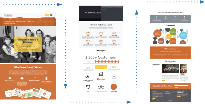
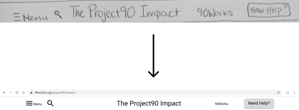
Project90’s current site is a single landing page
The Project90 model is designed to addess some of this frustration but the current site is difficult to understand. Some of the major issues are:
- Site Architecture: The site is a single page, which means the user is faced with a lot of content all at once, without a clear understanding of the relationship between different sections.
- Content Hierarchy: Important contect like “About Us” and information about the self-sufficiency model is not given the proper emphasis, relegated to the footer or located too far down the page for the user to find easily.
- Visual Design: Spacing between visual elements and text is too small, making the site seem jumbled and overwhelming.
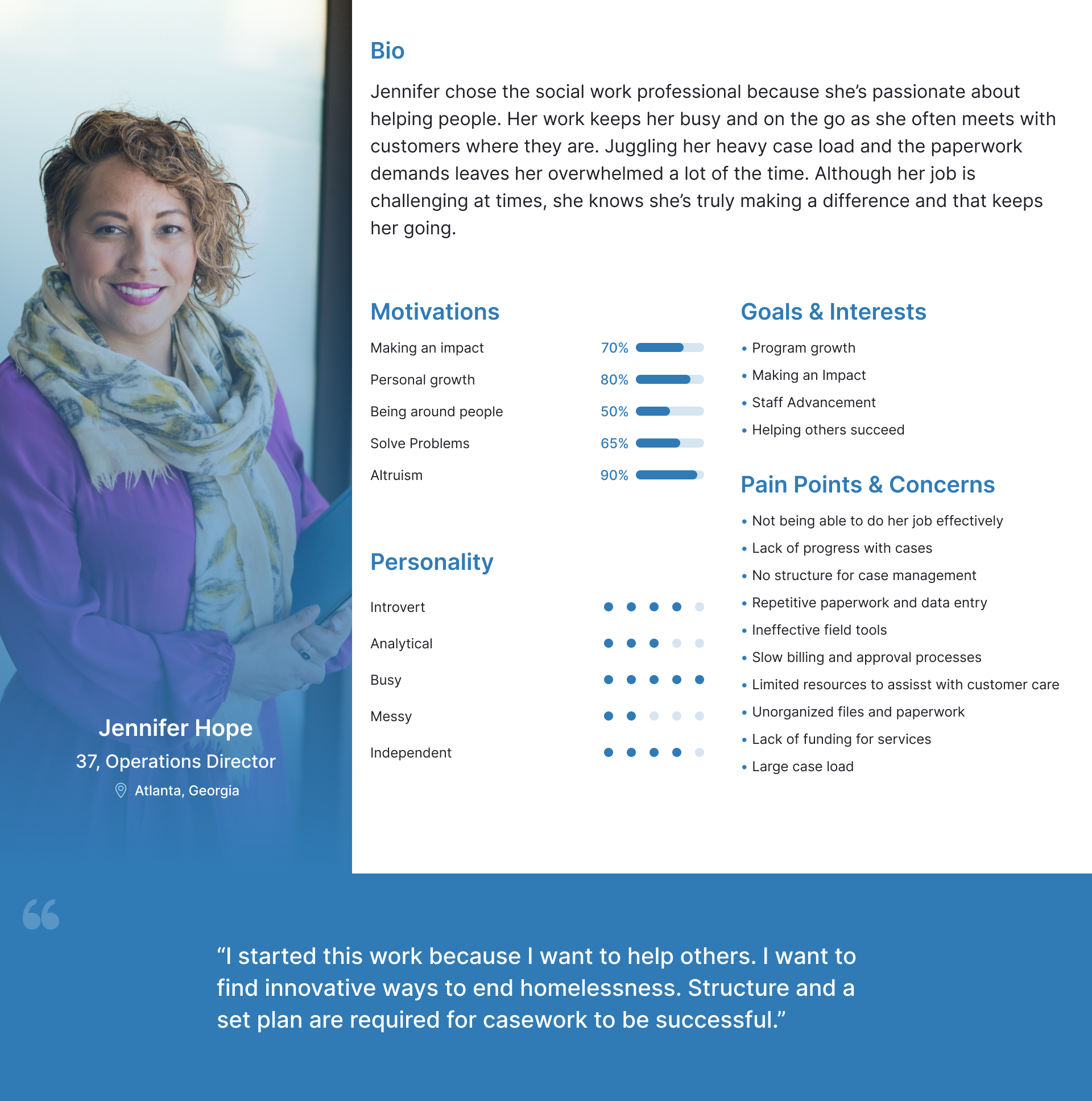
Persona & Definition
Our persona Jennifer was created from our research to start defining our problem. While Jennifer does feel like she is making a difference, she also feels like her impact is being continuously limited by lack of resources and time.
To better address Jennifer’s pain points, we redefined Project90’s Value Proposition:
90Works is developing Project90 Impact to help case workers focusing on eradicating homelessness be more effective with keeping their customers out of homeless. We’re better because we provide holistic services that are tailored to each individual customer’s basic needs. We’re believable because 100% of our customers remain self-sufficient and out of homelessness 6 months after case closure.
Using these two elements, we narrowed down our initial question into our final problem statement: How can we help caseworkers quickly understand the self-sufficency model and its benefits so that they feel empowered to implement the model for themselves?
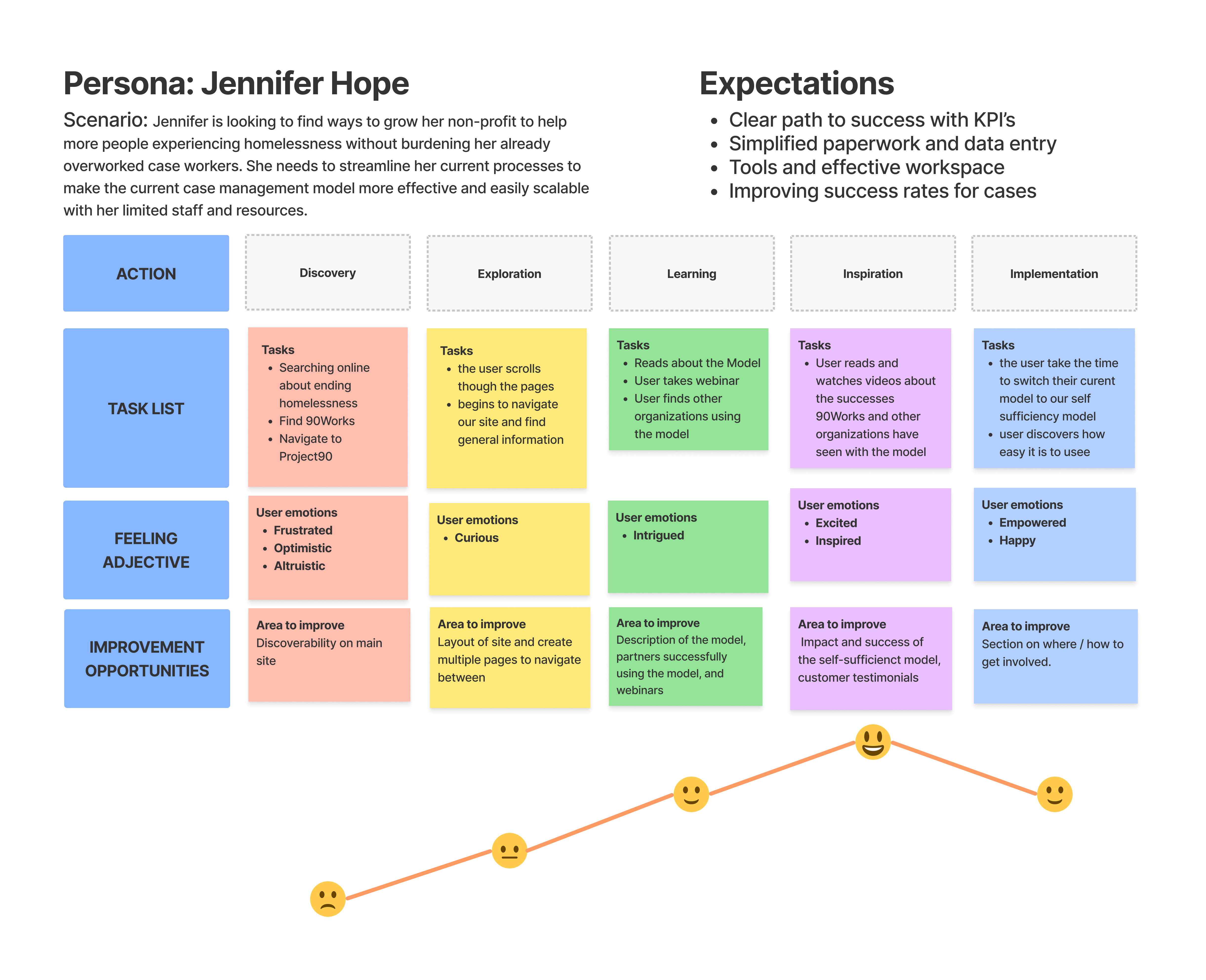
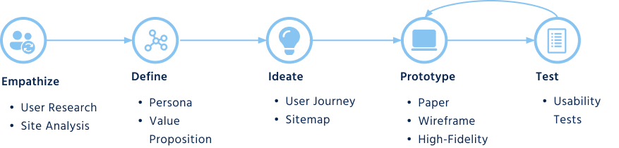
We reimagined Jennifer’s journey on the Project90 site, and defined the scope of our project by what could be accomplished in time for our deadline, two weeks away.
We focused on the Learning and Inspiration sections of the user journey for this project.
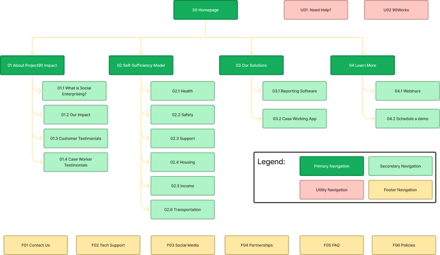
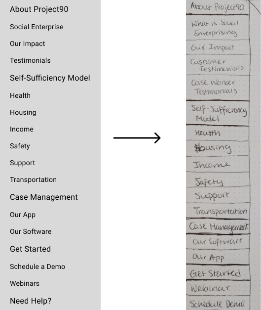
Site Architecture
We created a new sitemap, expanding from the current single-page site, to align with this new user journey. We mapped out the entire site, although we only designed a few key sections.
Design Iterations
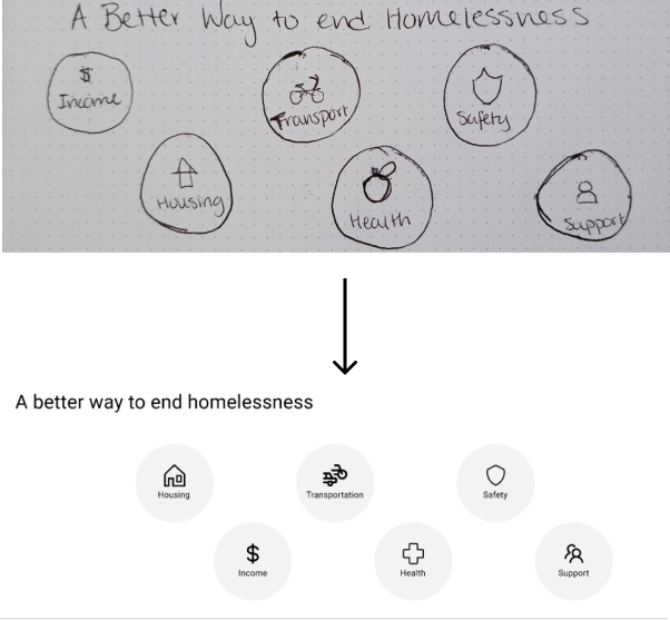
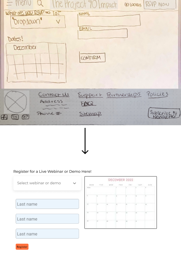
We chose to focus on making a better explanation of the self sufficiency model, including links to resources that would help case workers meet the needs of their customers within all 6 domains. To help explain the model further and get case workers on track to implement the model themselves, we also needed to create a way for them to RSVP for upcoming webinars, as well as access an existing library of on-demand recordings of previous webinars. We started with paper sketches, which we then iterated into a mid fidelity prototype after user testing.
Increasing the prominence of our Need Help button in the header.
Justification: We wanted to account for non-caseworkers that may come across this site, especially people at risk of or experiencing homelessness. This button would lead to a directory of resources for people to get the help they need. However, users had difficulty identifying this button in paper testing, so we made it more prominent in the mid-fi.
Changing section names in the navigation menu.
Justification: 1 out of our 5 users were unable to navigate to the webinar registration page, so we reworked the navigation labels to reduce ambiguity.
Adding a hover interaction to clickable elements in the model overview.
Justification: Users didn’t initally realize these icons were clickable, so we added a rollover feature to provide more information about the model as well as signal clickability.
Changing webinar registration to a pop-up modal instead of a separate page.
Justification: A more seemless experience for user since they don’t have to navigate to a separate page and can continue browsing both recorded and upcoming webinars after registration.
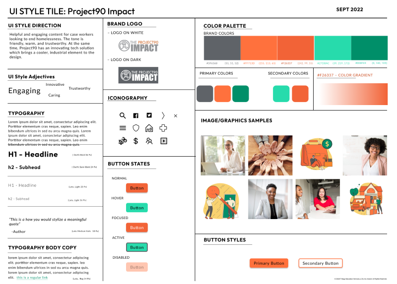
Implementing a Design Sytem for our final Solution
A branding exercise was outside of the scope of this project, so we chose to keep their exising logo and use their brand orange as the base of our color palette. To soften out the industrial feel of the orange and grey scheme, we introduced some complementary teals and soft graphic elements to express the warmth and approachability of this non-profit brand.
We implemented this new design system to create our final high fidelity protoype:
Concluding Thoughts
This project was an excellent study on the use of color and the important of balance and white space in a design. Personally, was really rewarding getting to work with an more experienced visual designer on this project. I learned a lot about the nuances of color theory and visual weight while listening to her thought process. It was especially helpful having the opportunity to implement her stylistic decisions to create a final mock up.
Future iterations would include designing the rest of the site and continuing to iterate on the design system.